 EUR
EUR  USD
USD
 GBP
GBP
 AUD
AUD
 CAD
CAD
 VND
VND
 JPY
JPY
 KRW
KRW
 IDR
IDR
 CZK
CZK
 ZAR
ZAR
 ILS
ILS
 PLN
PLN
 HUF
HUF
 UAH
UAH
 KYD
KYD
 PEN
PEN
 BHD
BHD
 RUB
RUB
 AED
AED
 CNY
CNY
 DOP
DOP
 TRY
TRY
 KES
KES
 BRL
BRL
 PKR
PKR
 KHR
KHR
 NZD
NZD
 MYR
MYR
 OMR
OMR
 PHP
PHP
 NGN
NGN
 EGP
EGP
 NIO
NIO
 TTD
TTD
 HRK
HRK
 TWD
TWD
 KZT
KZT
 BDT
BDT
 RSD
RSD
 SEK
SEK
 NPR
NPR
 THB
THB
 SAR
SAR
 LKR
LKR
 BOB
BOB
 CHF
CHF
 BGN
BGN
 QAR
QAR
 DKK
DKK

How to combine wallpaper by color?
Posted by Jere Bradwell on 23rd Apr 2020
There are many ways to create a non-standard interior or to zone a room. The combination of wallpaper is one of the least costly in terms of resources and time. This technique is used by those who want to save money or who want to neutralize the existing layout drawbacks: non-winning ridges or niche, too low ceilings, narrow space. The main thing during the repair is to take into account all the features of the room.
The purpose of the combination should be the desire not only to dispel boredom. It is intended to focus on some point or zone.
Scientists have proven that colors affect not only mood but also health. For a comfortable life, design colors are combined according to certain rules. Not all shades look harmoniously next to each other. Sometimes even unexpected combinations are fascinating, in other cases you want to look away as soon as possible. Combinations for the interior are selected according to the same principle by which the bouquet is assembled.
Tips and rules
When accentuating one of the walls with wallpaper, you must select the "correct" one. Usually this is the wall that attracts the eye when entering a room. It can also be located in the background of one of the functional areas or behind a furniture group: a dining room, a desk, or upholstered furniture, which will only benefit from a suitable background.
 Shades of the same color.
The combination of wallpaper of the same color in one room is considered classic. Walls can be patterned, regular, chaotic, or barely pronounced. For a small room, two types of wallpaper with the same pattern, somewhat different in shade is the most acceptable combination. Monochromatic combinations can differ only in saturation. More juicy shades highlight the priority zone. Any room will look organic if there is a combined finish of the same color, but with a different texture. Textured elements look much more spectacular if they are made in the same color. Shiny surfaces look unusual, combined with matte. In addition, small rooms with shiny walls will visually seem more spacious.
Contrasting color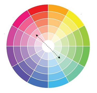
The correct combination
of several bright canvases in the interior is a delicate matter. The contrast
method is most often used in living rooms or bedrooms. One of the colors should
be active, and the other one should be neutral. Modern design ideas are based
on stylishness, rejection of the ordinary. Special techniques consist in
combining warm and cold colors, the use of catchy colors. Possible options are:
- simple, when harmonious, unidirectional color schemes are combined;
- moderate, when the tones of wallpaper do not combine with each other, but have
a common space;
- difficult if the interior is decorated with more than three colors of different
saturation.
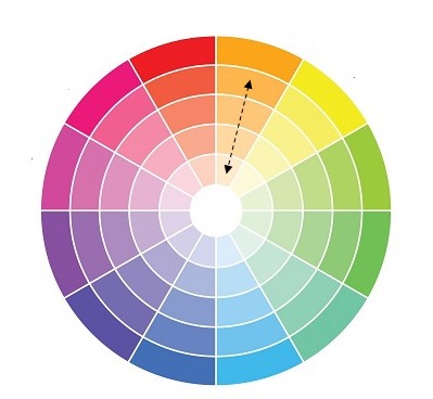
Neighboring shades of the color wheel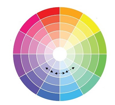
To maintain the integrity of the interior, do not miss the choice of finishing colors, use a special cheat sheet, called the color wheel. You can use it to pick up similar colors, just taking 2-3 or 5 located next to each other. At first glance, similar colors are completely different, but their use in the interior looks harmonious, each shade smoothly flows from one to another. As a rule, this is a combination of two or three adjacent shades from the color wheel.
Combination of individual colors
- White Universal
color. It is combined with any shades. The most successful
combination with black, blue and red. - Beige Chocolate, white, red, blue, emerald, black.
- Black Like white,
a universal color, successfully combined with many shades.
Successful combinations are white, red, lilac, pink, orange. - Brown Ivory, beige, green, pink.
- Grey The whole palette is pink, from pastel to fuchsia. Red, blue, plum.
- Green Yellow, golden, orange, chocolate, black, gray.
- Pink Gray, chocolate, turquoise, the color of young greenery, olive, pale blue.
- Blue Gray, orange, green, red, white, blue.
- Light blue White, pink, gray, yellow, brown, red.
- Lilac White, green, pink, chocolate, gray, black.
- Red White, blue, green, black, yellow.
- Yellow Brown, gray, black, blue, turquoise.
- Violet White, yellow, orange, lilac, black.
Grace & Gardenia Blooms Wallpaper
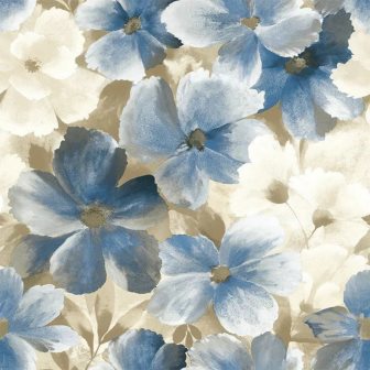
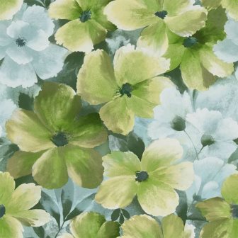
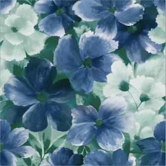
G10101 Soft Blue & White G10106 Green & Blue G10110 Vivid Blue
Transitional version of classic floral done in a fresh watercolor style.
A combination of blooms to bring romance and style to any décor.
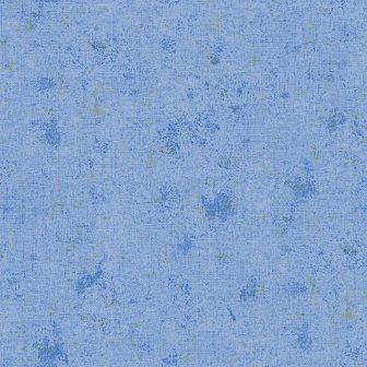
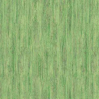
G10111 Periwinkle Blue G10118 Grass Green Plaster
This bright and cheerful blue and grass greens papers
work well with all of the Bloom wallpapers from Grace & Gardenia
